Journey Planner App

Mobile App Design
UX design
Sweden 2023
  • User Experience Design
  • User Interface Design
  • Mobile application design
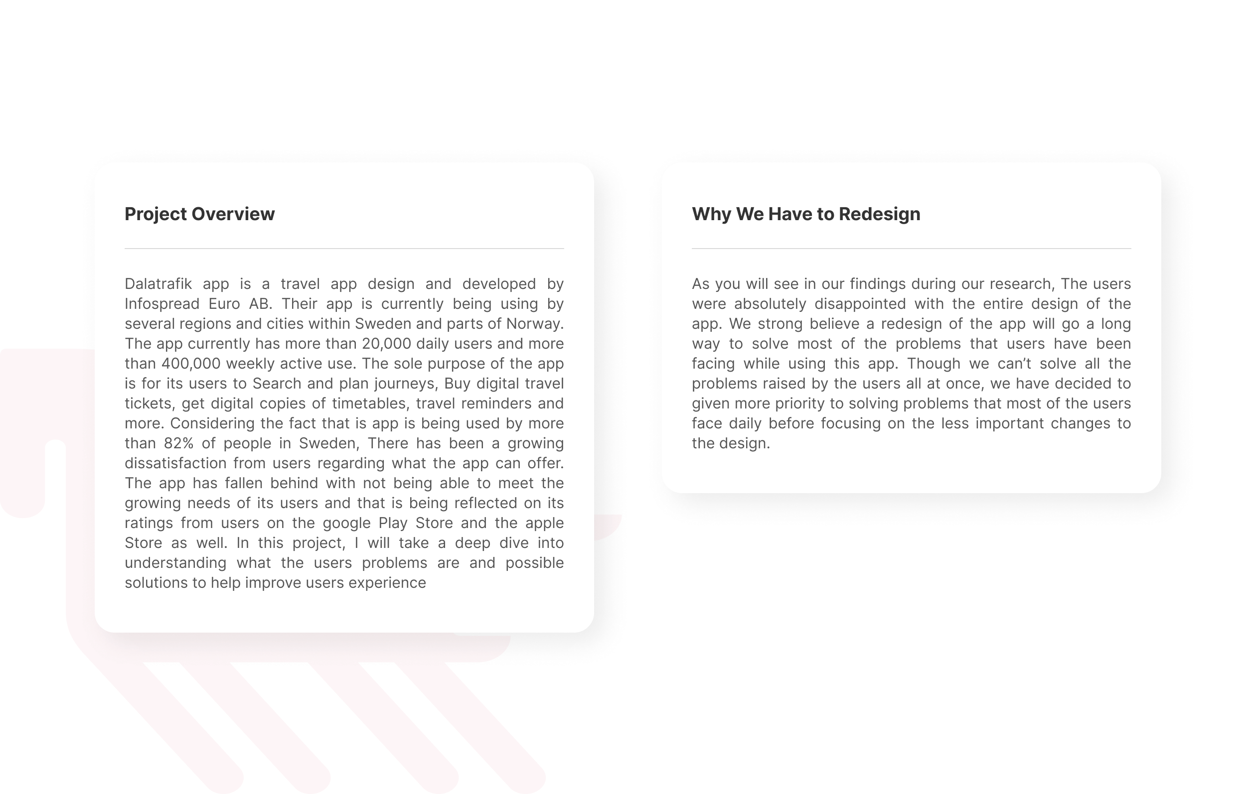
Dalatrafik app is a travel app design and developed by Infospread Euro AB. Their app is currently being using by several regions and cities within Sweden and parts of Norway. The app currently has more than 20,000 daily users and more than 400,000 weekly active use. The sole purpose of the app is for its users to Search and plan journeys, Buy digital travel tickets, get digital copies of timetables, travel reminders and more. Considering the fact that is app is being used by more than 82% of people in Sweden, There has been a growing dissatisfaction from users regarding what the app can offer. The app has fallen behind with not being able to meet the growing needs of its users and that is being reflected on its ratings from users on the google Play Store and the apple Store as well. In this project, I will take a deep dive into understanding what the users problems are and possible solutions to help improve users experience
Over view

Design Process,Scope Of Work & Timeline

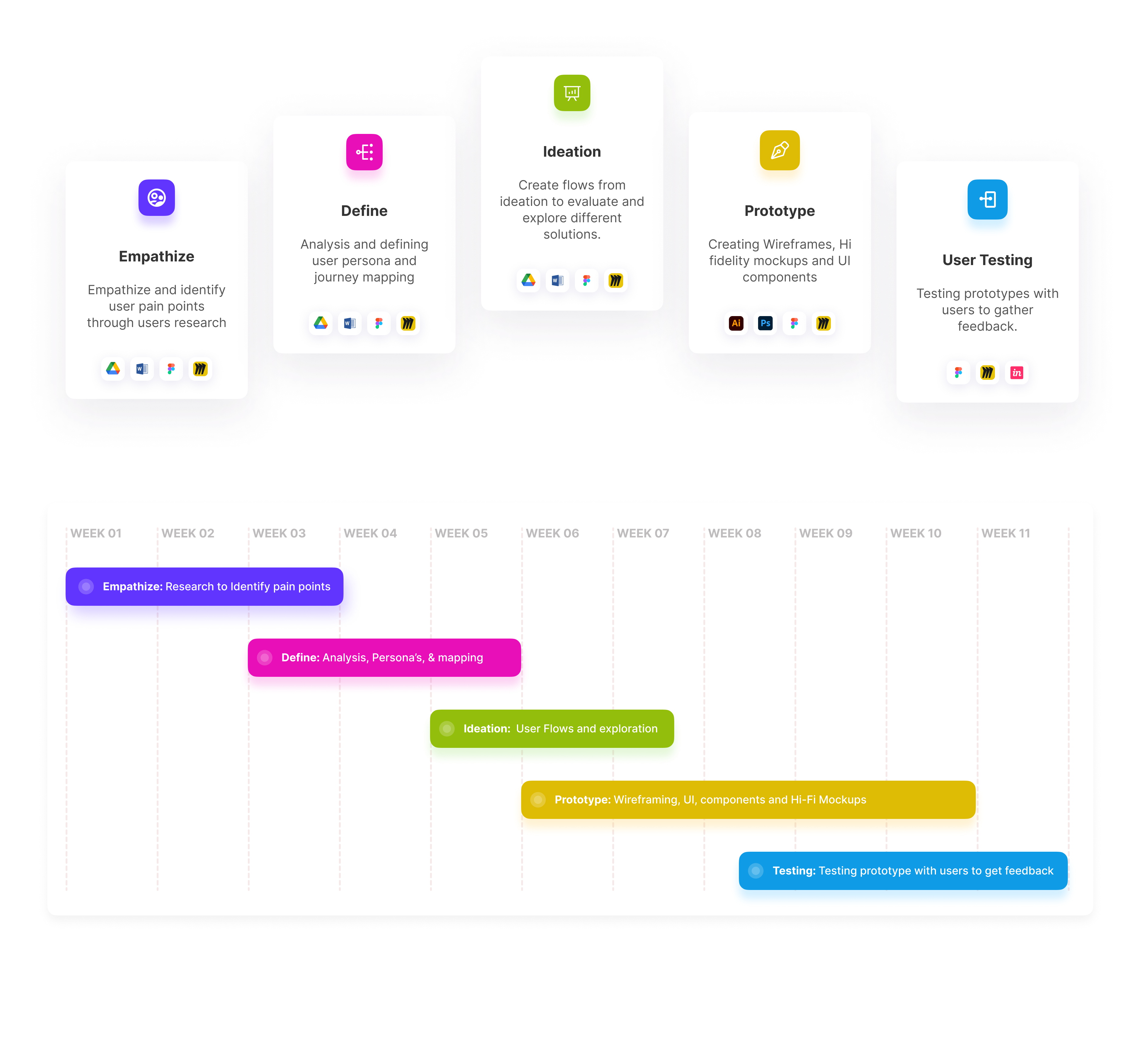
In this project, I followed the Design Thinking Technique to ensure that the user was at the front and center of every design decision.

Design process & Timeline

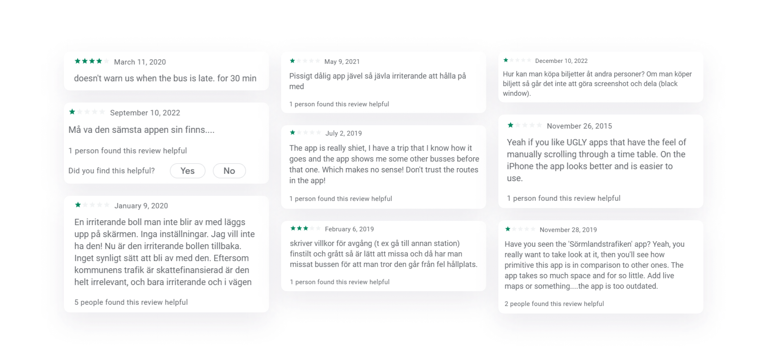
Desk Research

It was very easy for me to get a lot of user feedback from user reviews from Google play store and ISO App store. Considering the fact that all Regions where this app is being use had an average rating of 2.5/ 5 with many negative reviews. It was a good start for me to understand some of the problems.

Research

User Interviews

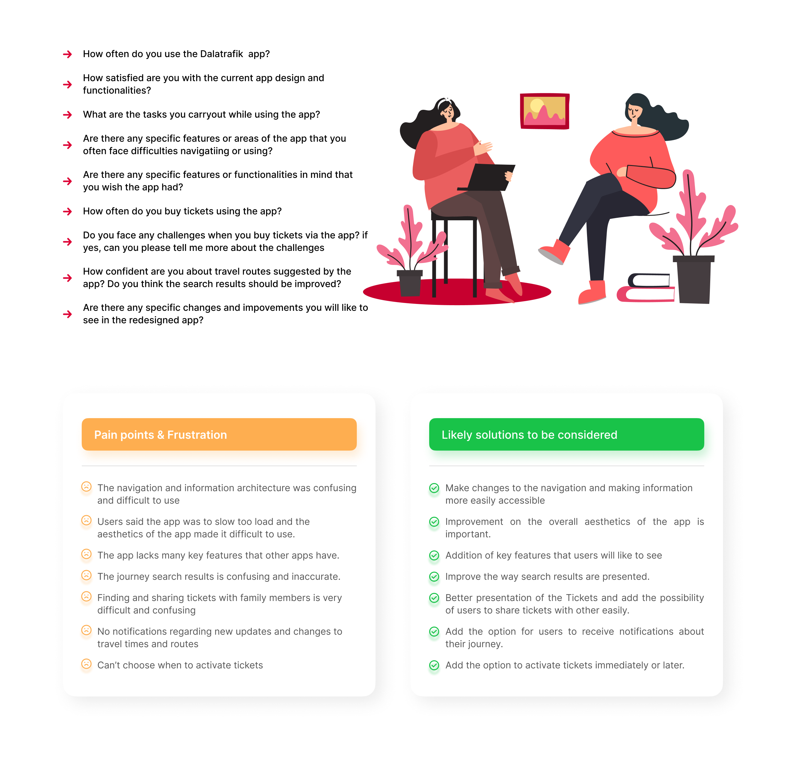
I conducted user interview with users of the Dalatrafik app and users from other regions in Sweden where this app is being used. I had to do this interview to get a deep understanding of the users pains and challenges they face while using the app. Some of the Questions asked during the interview can be found below.

Frame 52

Competitor Analysis

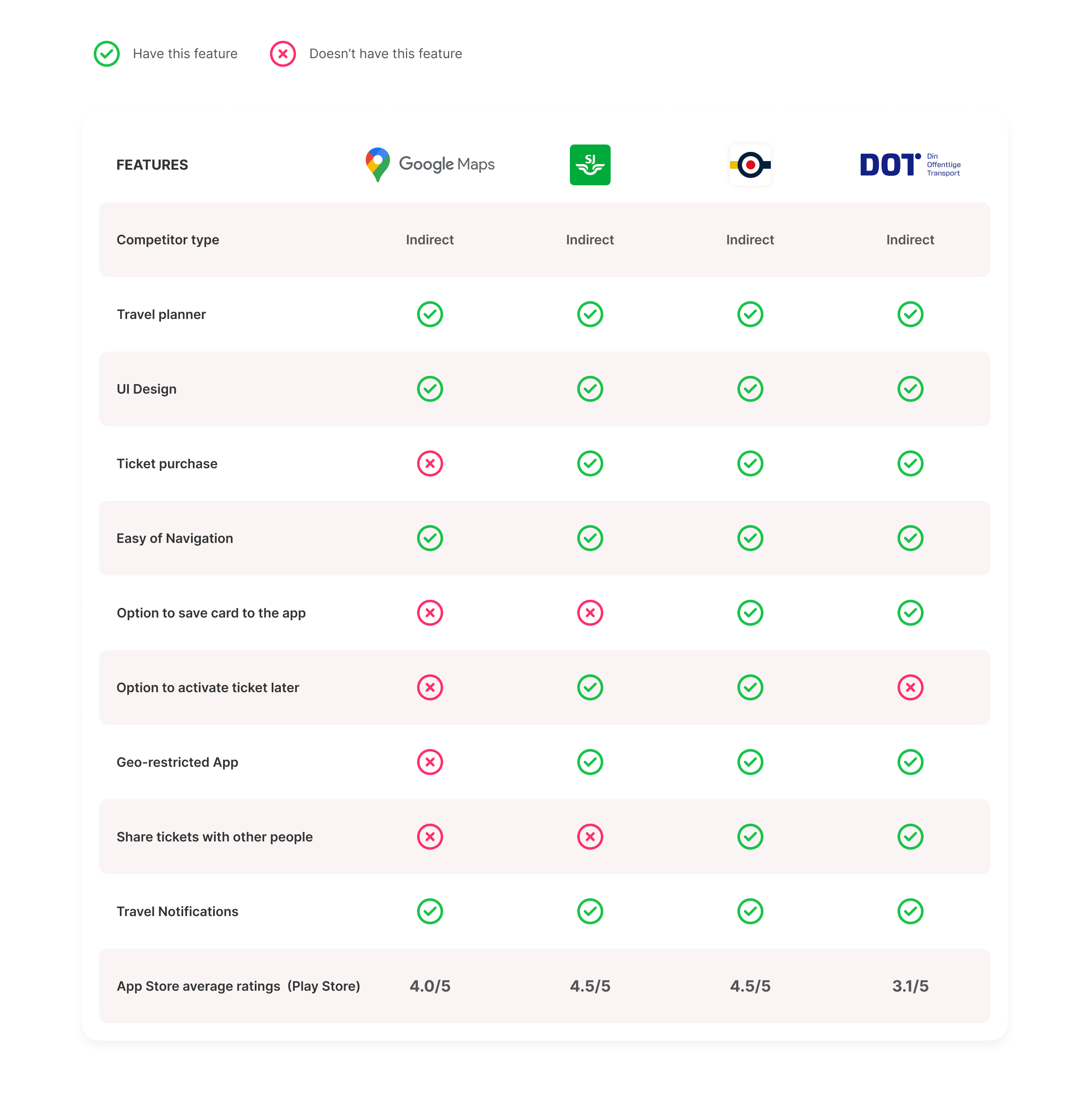
I conducted a competitor analysis of different Travel planner apps, to help me understand the strengths and weaknesses to earn the ins and out of how competitors works and to identify potential opportunities that we can leverage to make Dalatrafik better than its competitors.

Competitor analysis

User Persona

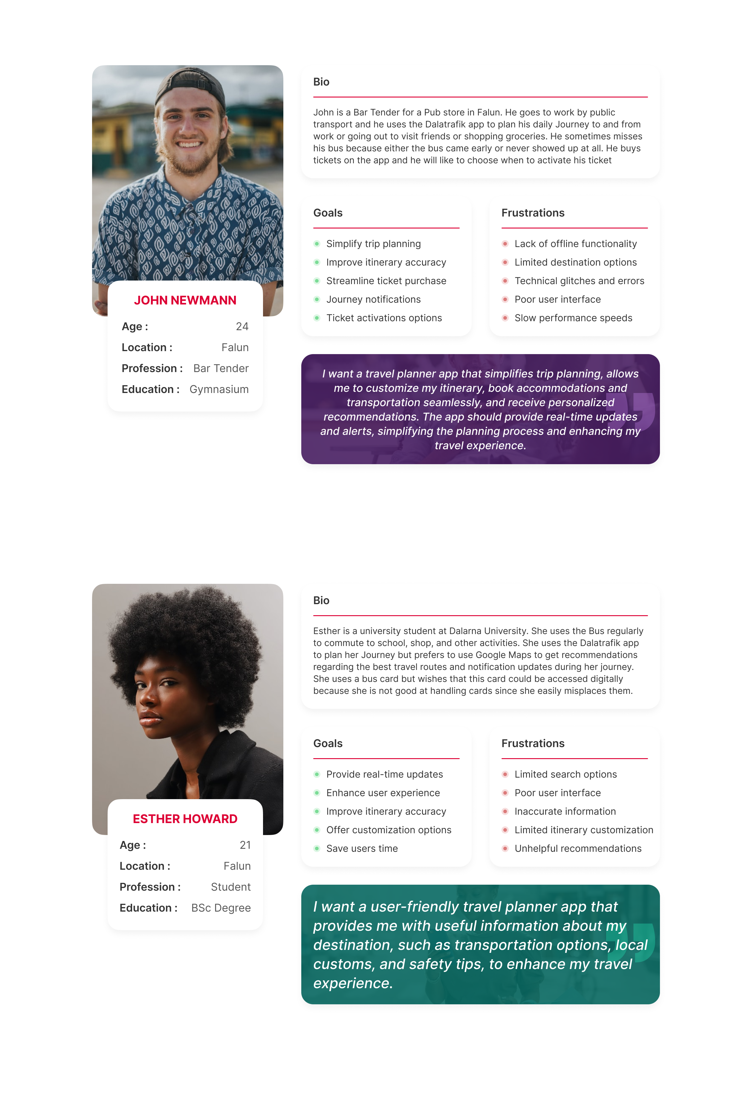
To help in the design and development of a product that meets the needs of the users, I decided to create a frictional representation of different users groups. By so doing, I am a able to better understand the problems of the different groups of users in my research.

User persona

Empathy Mapping

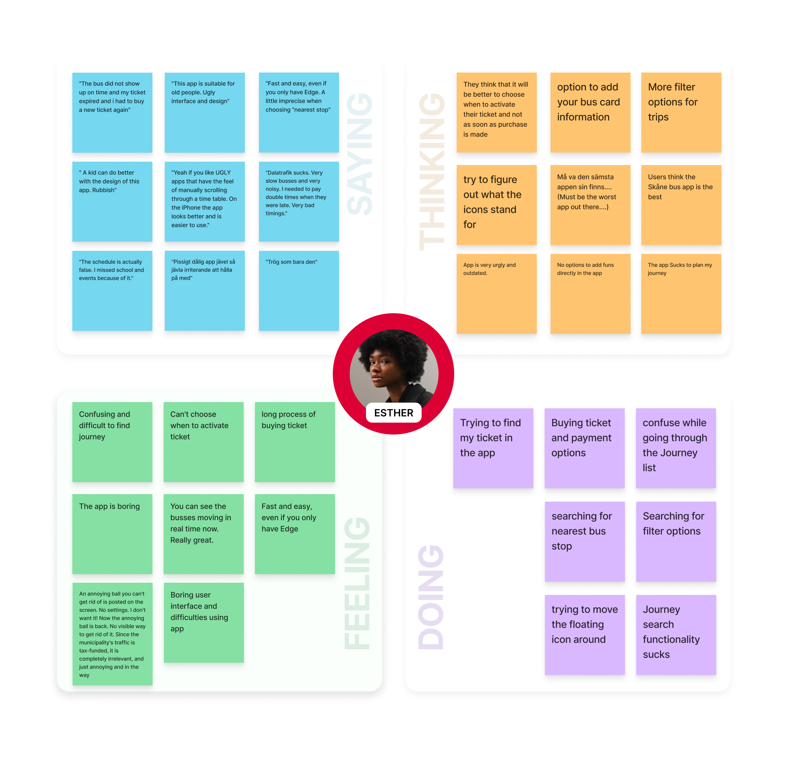
The purpose of an empathy mapping is to gain a deeper understanding of a specific user or customer by examining their attitudes, behaviors, motivations, and pain points. It helps me to put myself in the user's shoes to gain a more empathetic perspective on their needs and experiences while using the Dalatrafik App.

Empathy mapping

Journey Mapping

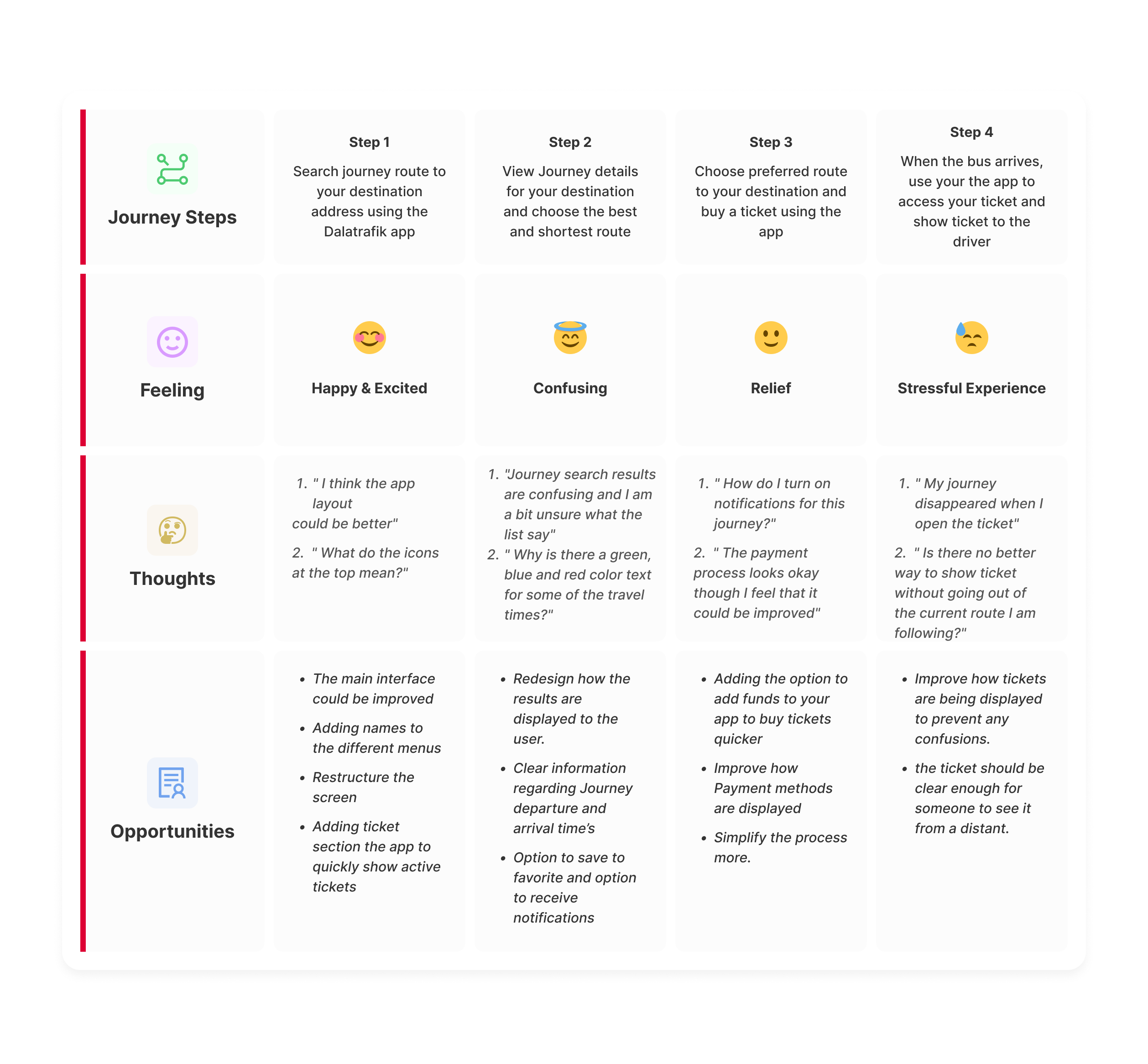
The purpose of an empathy mapping is to gain a deeper understanding of a specific user or customer by examining their attitudes, behaviors, motivations, and pain points. It helps me to put themselves in the user's shoes to gain a more empathetic perspective on their needs and experiences while using the Dalatrafik App.

Journey Mapping
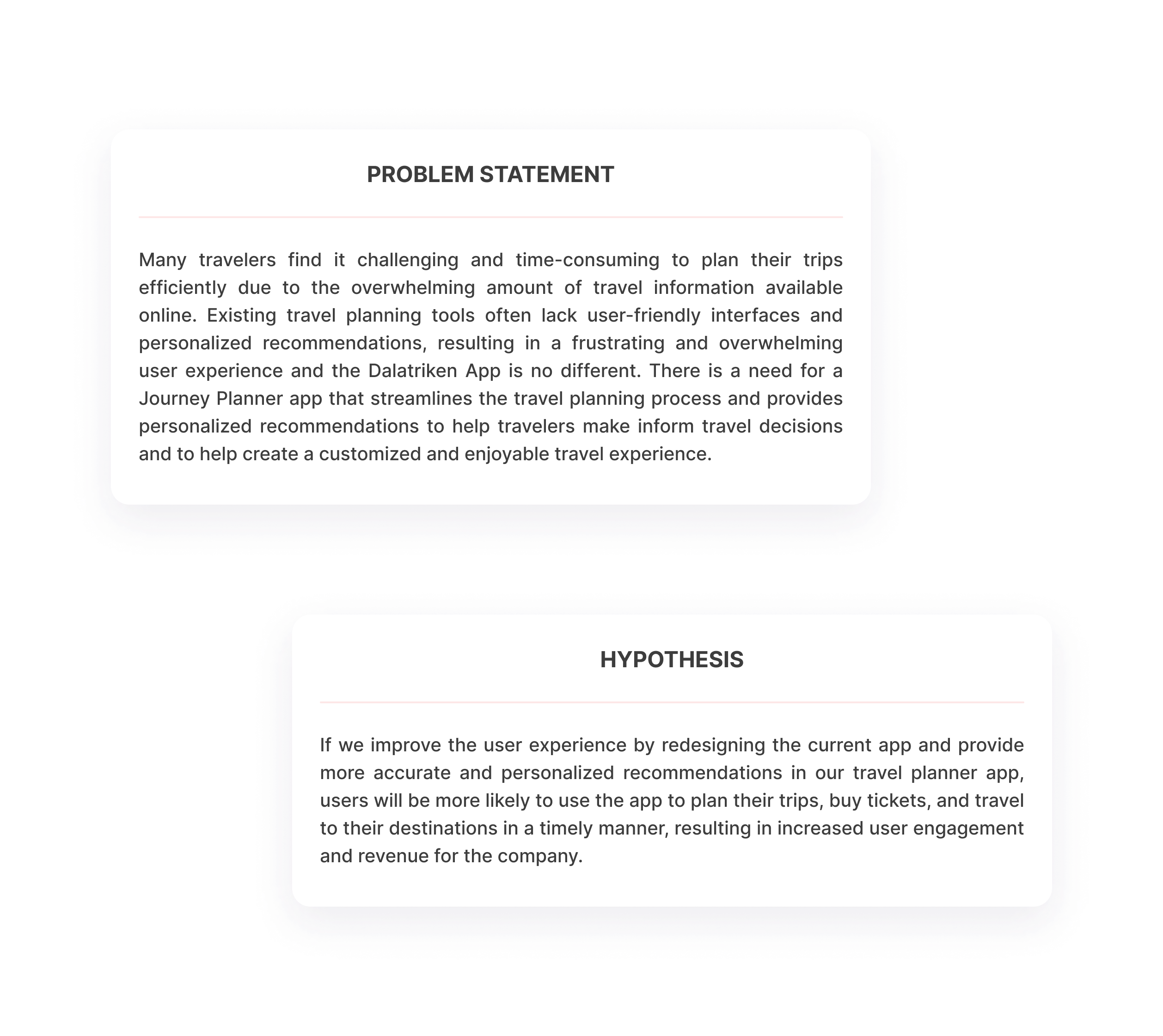
Problem statement

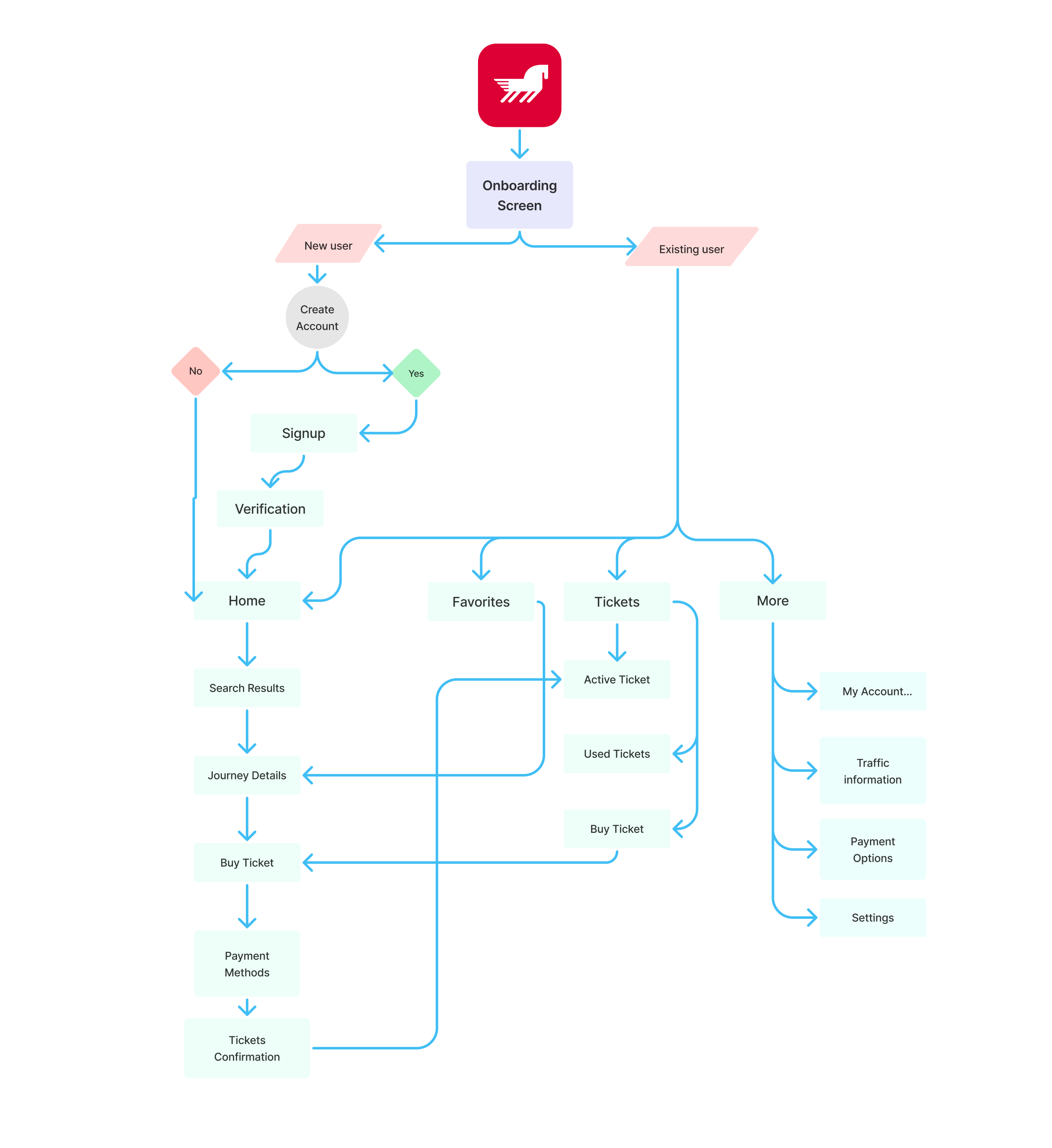
User Flow

The user flow was very important because it gave me a better understanding of the steps the user will take to achieve his/her goal. it is important to note that is a summarized version of the user flow map and not a comprehensive detailed flow of the app.

Frame 53

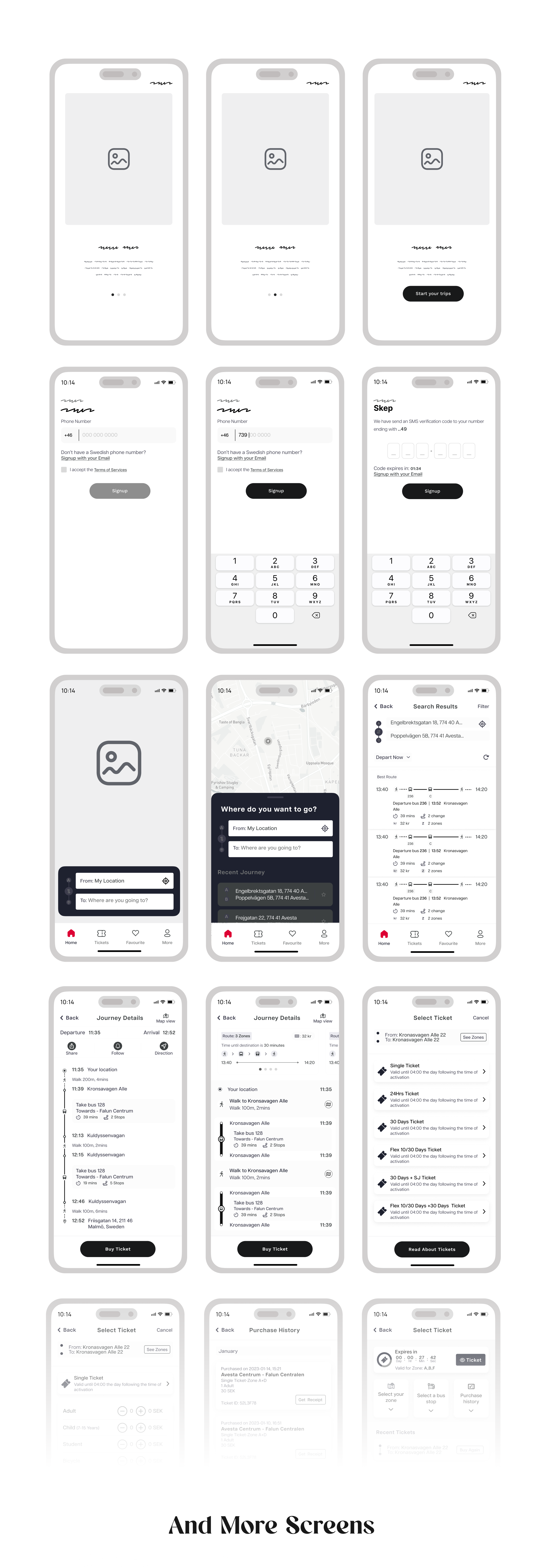
Low Fidelity Wireframes

Employing the "Crazy Eight" method, I swiftly sketched several iterations illustrating how I envisioned the various screen designs. This approach allowed me to promptly evaluate and eliminate designs that did not align with the user's requirements and preferences.

Wireframes

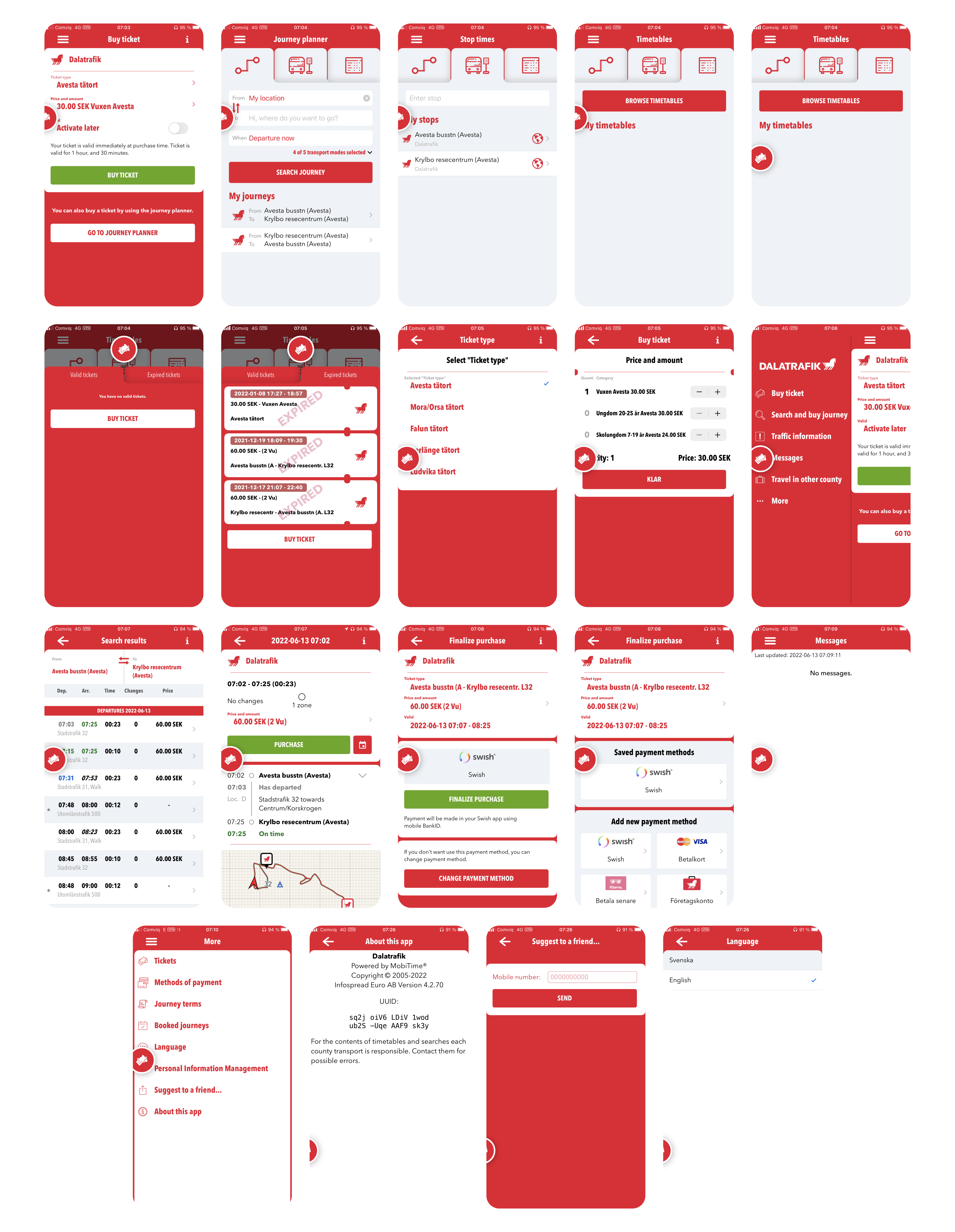
The Old/Current App Design Screens

In order to gain a deeper insight into the initial state of the app when I commenced the project, I have compiled all the screens as they existed at that time. While there have been recent updates to the application, it largely retains its core appearance, with a few additional functionalities seamlessly integrated.

Frame 812

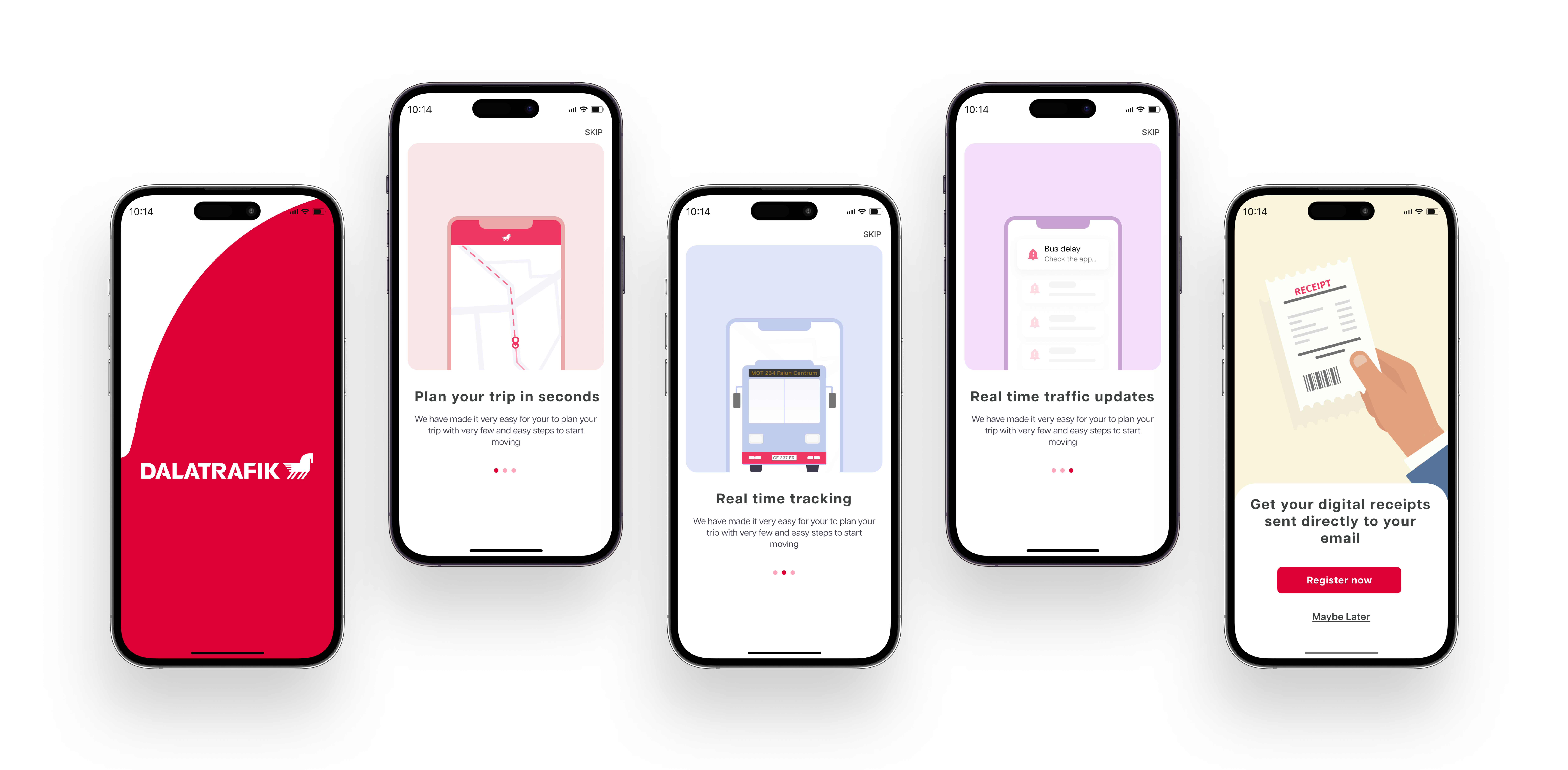
New HI-FI Designs

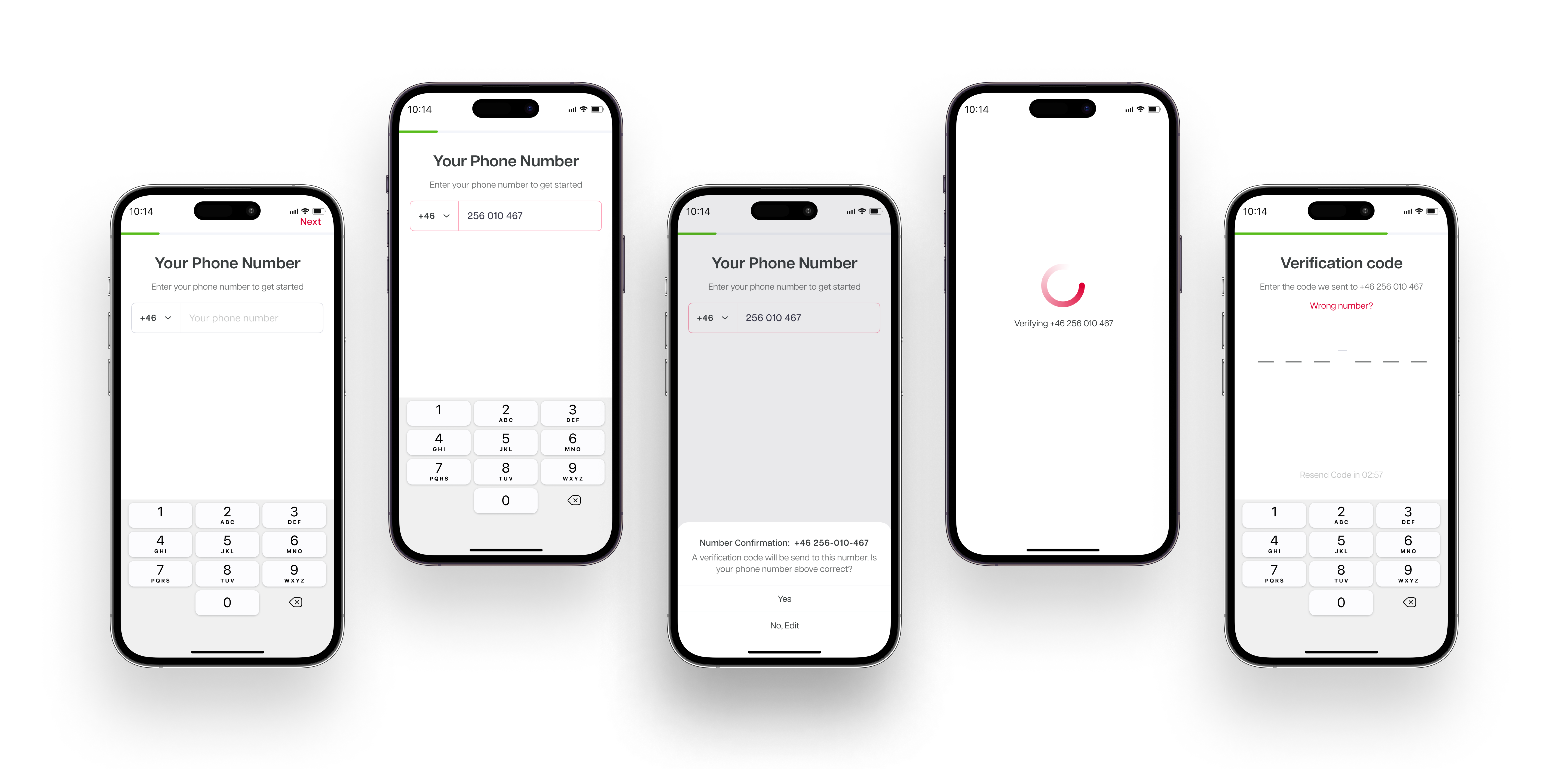
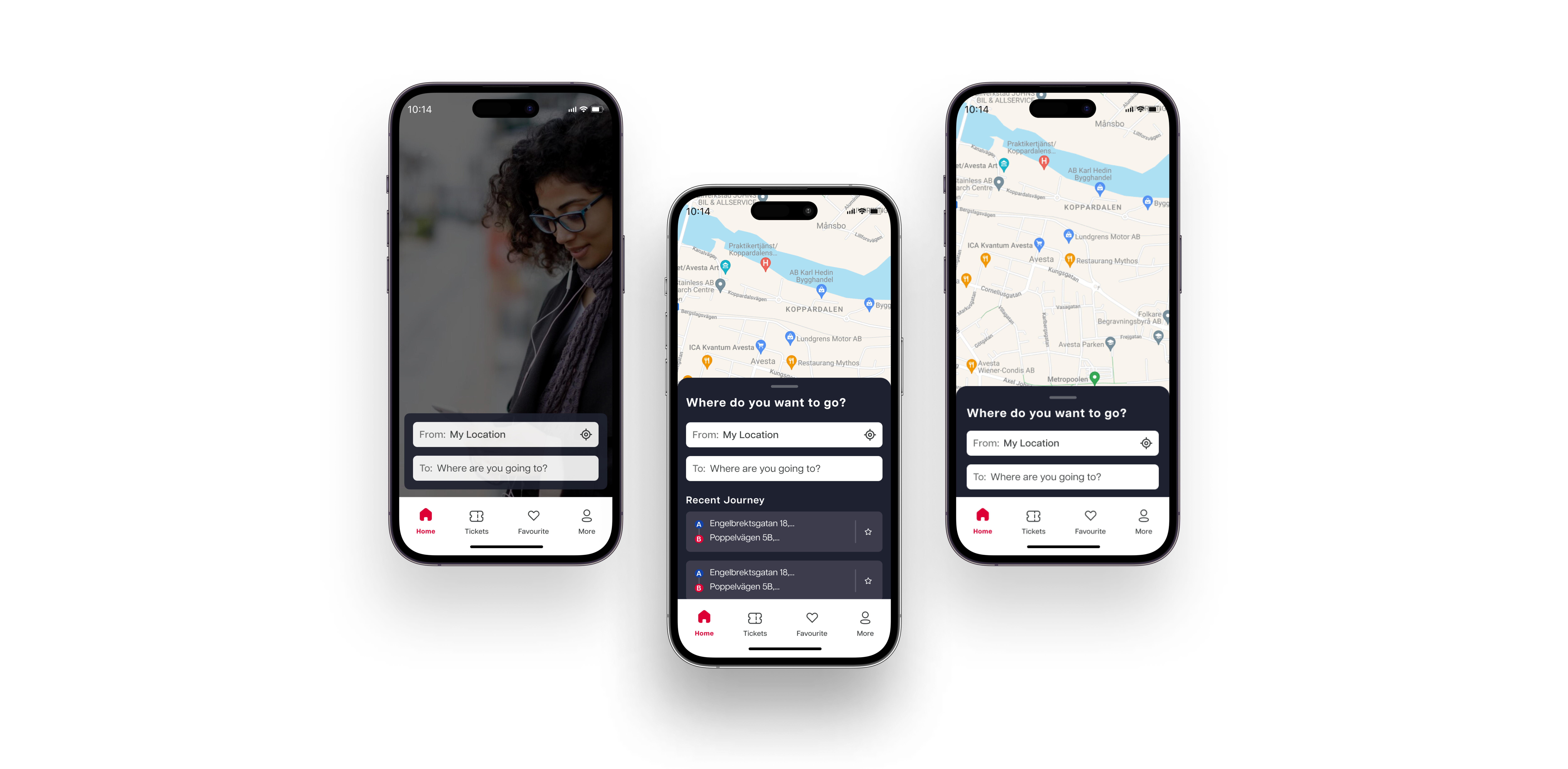
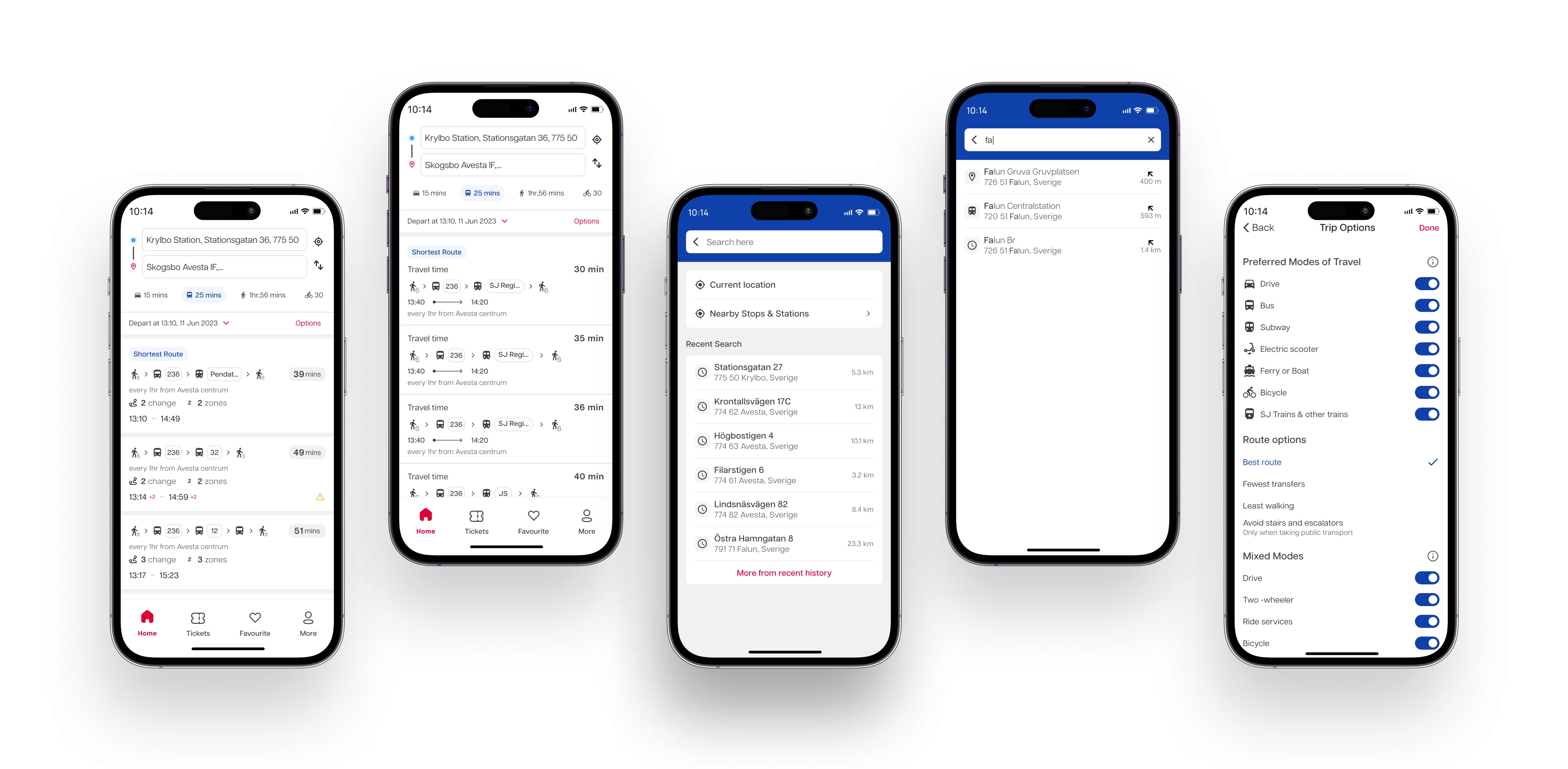
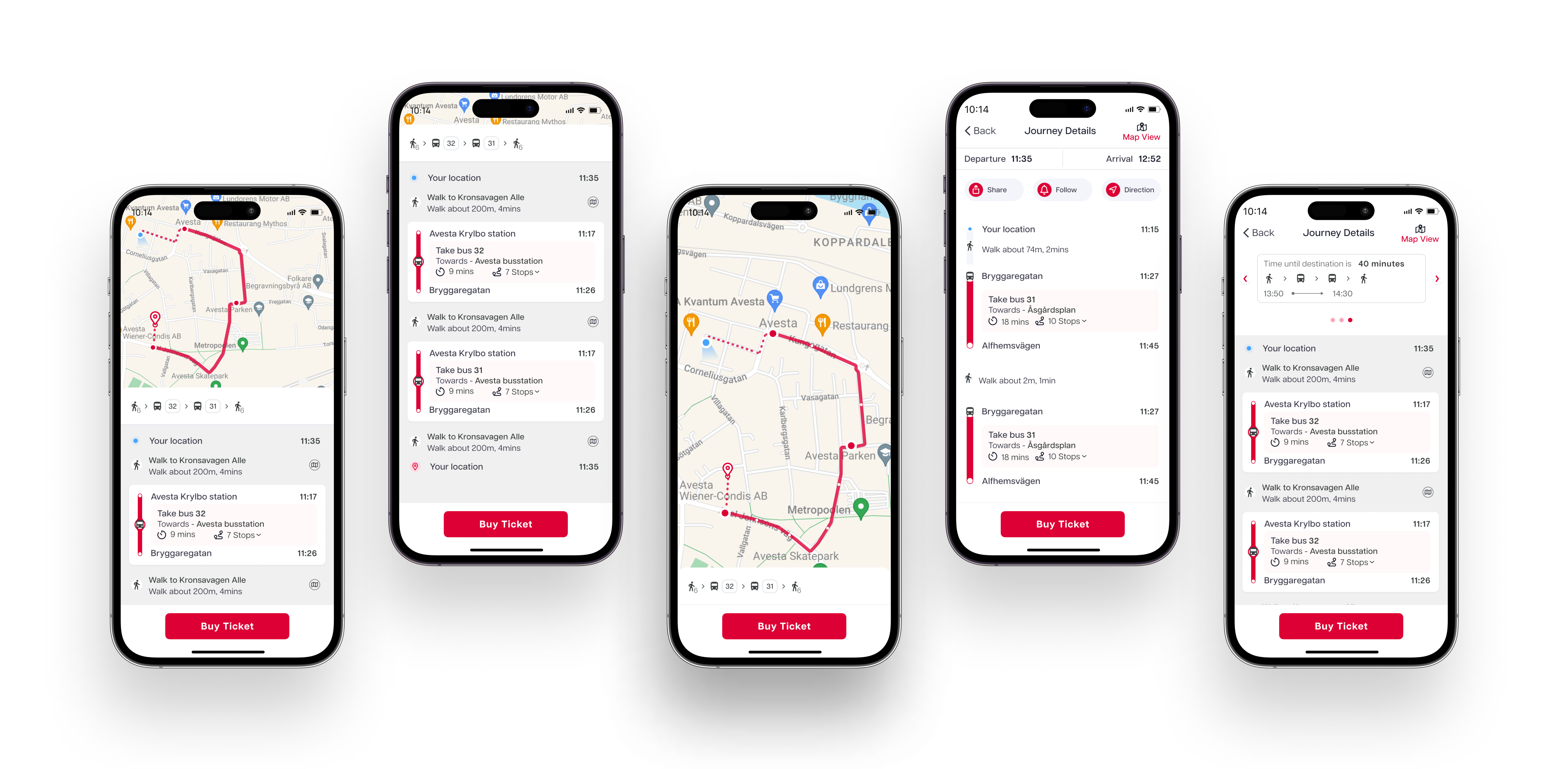
Displayed below are the screens showcasing the new designs. While this presentation doesn't delve into the specifics of my design choices and the changes implemented, I am readily available to provide a comprehensive explanation of this project. Feel free to reach out to me directly if you'd like to explore further.

Unboarding Screens

iPhone 14 Pro Mockup 3

Verification Screens

iPhone 14 Pro Mockup 2

Home Screens

iPhone 14 Pro Mockup home

Search Result Screens

iPhone 14 Pro Mockup 4

Journey Details Screens

iPhone 14 Pro Mockup 32

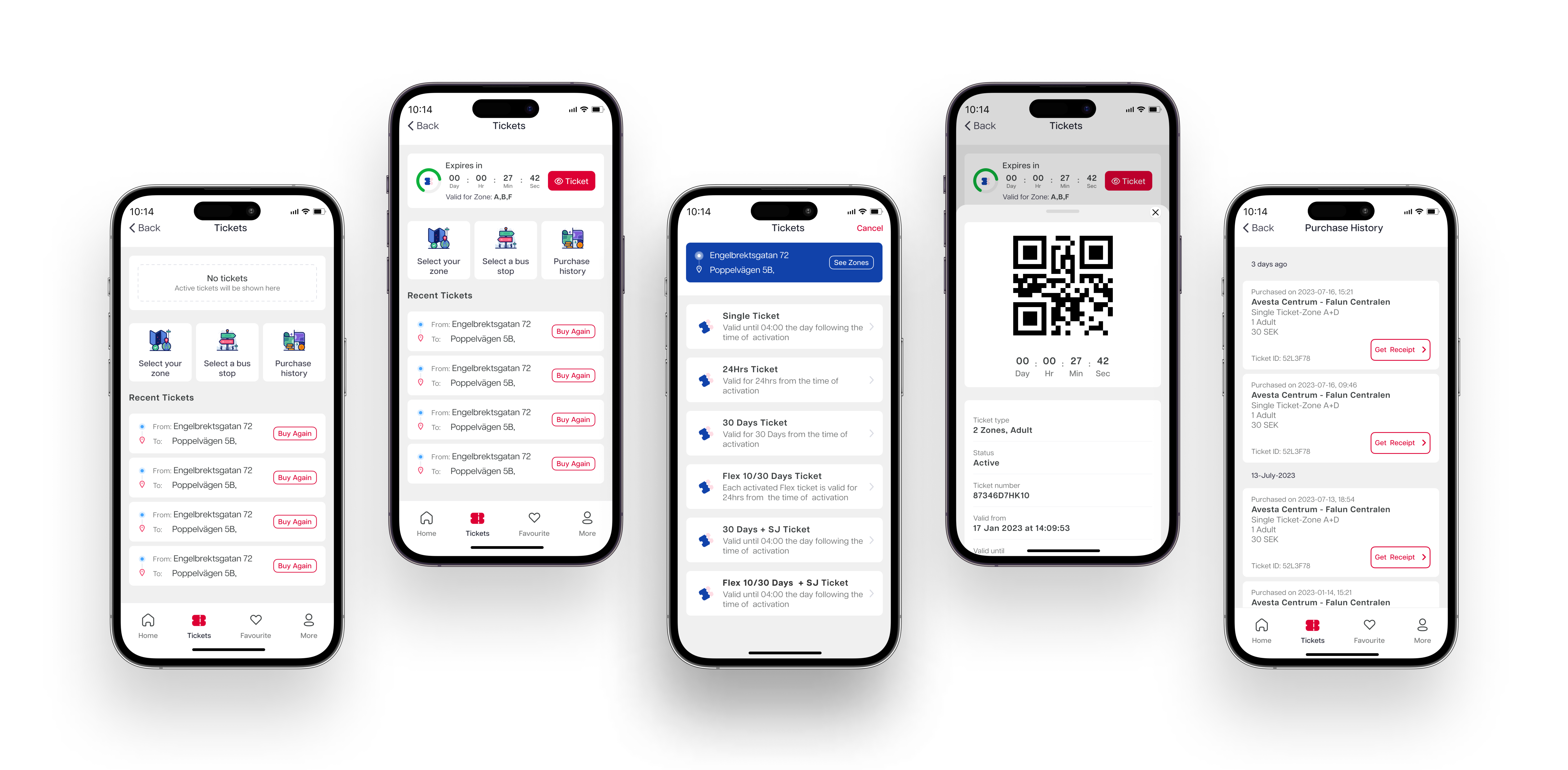
Ticket Screens

iPhone 14 Pro Mockup 6

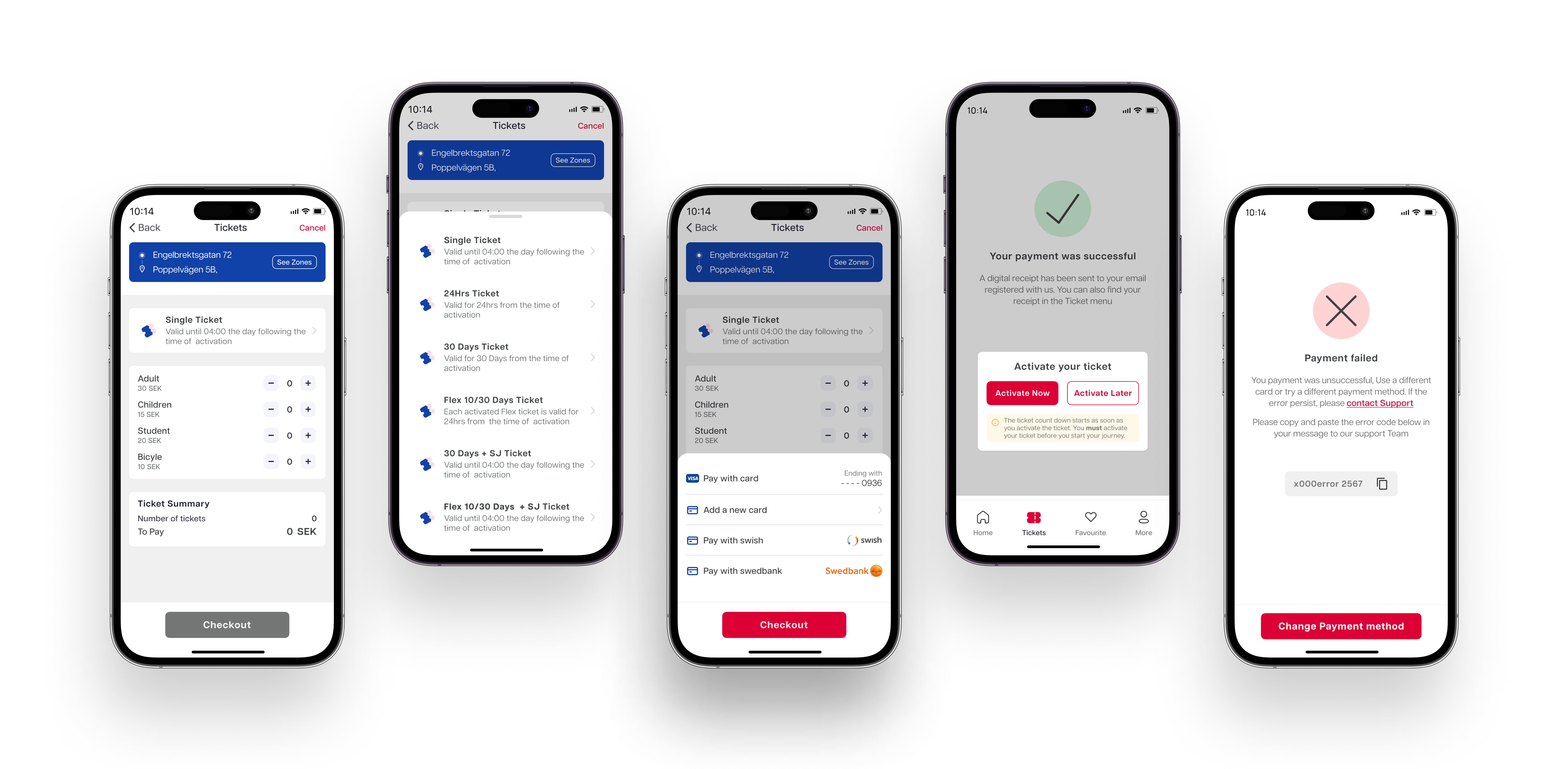
Ticket Purchase Screens

iPhone 14 Pro Mockup 3f